
Benchify
A visual identity built for a technical startup and flexible enough to stay with it as the company evolved.
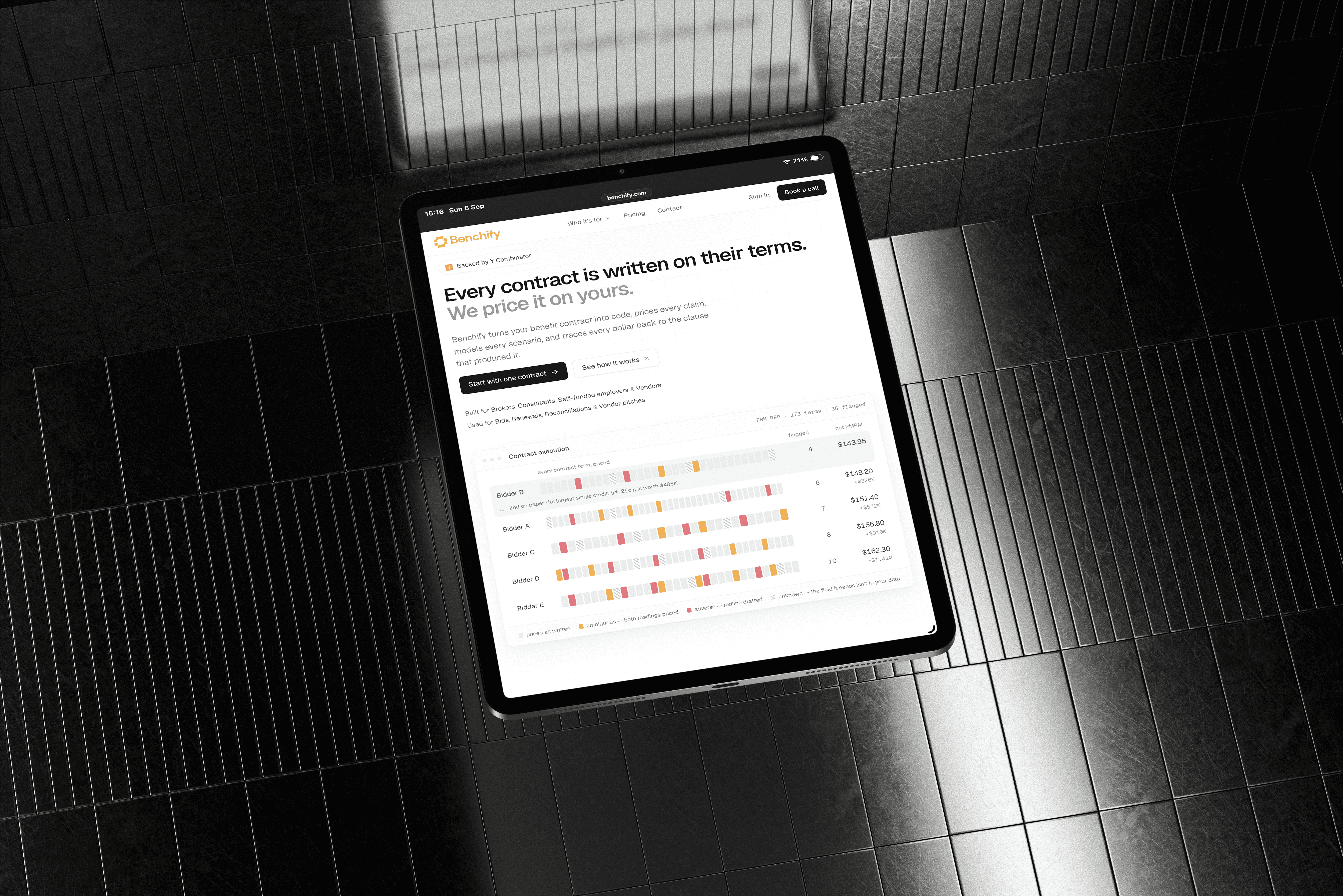
Giving an ambitious technical product an identity people could understand and remember.
When I began working with Benchify in 2023, the product was centered around making software testing faster and more reliable through advanced mathematical methods. The technology was sophisticated, but the identity needed to communicate that intelligence without feeling inaccessible or overly technical.
Challenge
Making a highly technical product feel clear, credible, and approachable.
Benchify was built around complex technical ideas, but its identity needed to communicate that intelligence without becoming intimidating or overly specialized.
Objective
Build an identity that could grow with the company, not just its first product.
The goal was to create a distinctive visual system with enough character to be recognizable, but enough flexibility to work across new products, audiences, and applications.


THE IDEA
A system inspired by connection, logic and the structure behind computation.
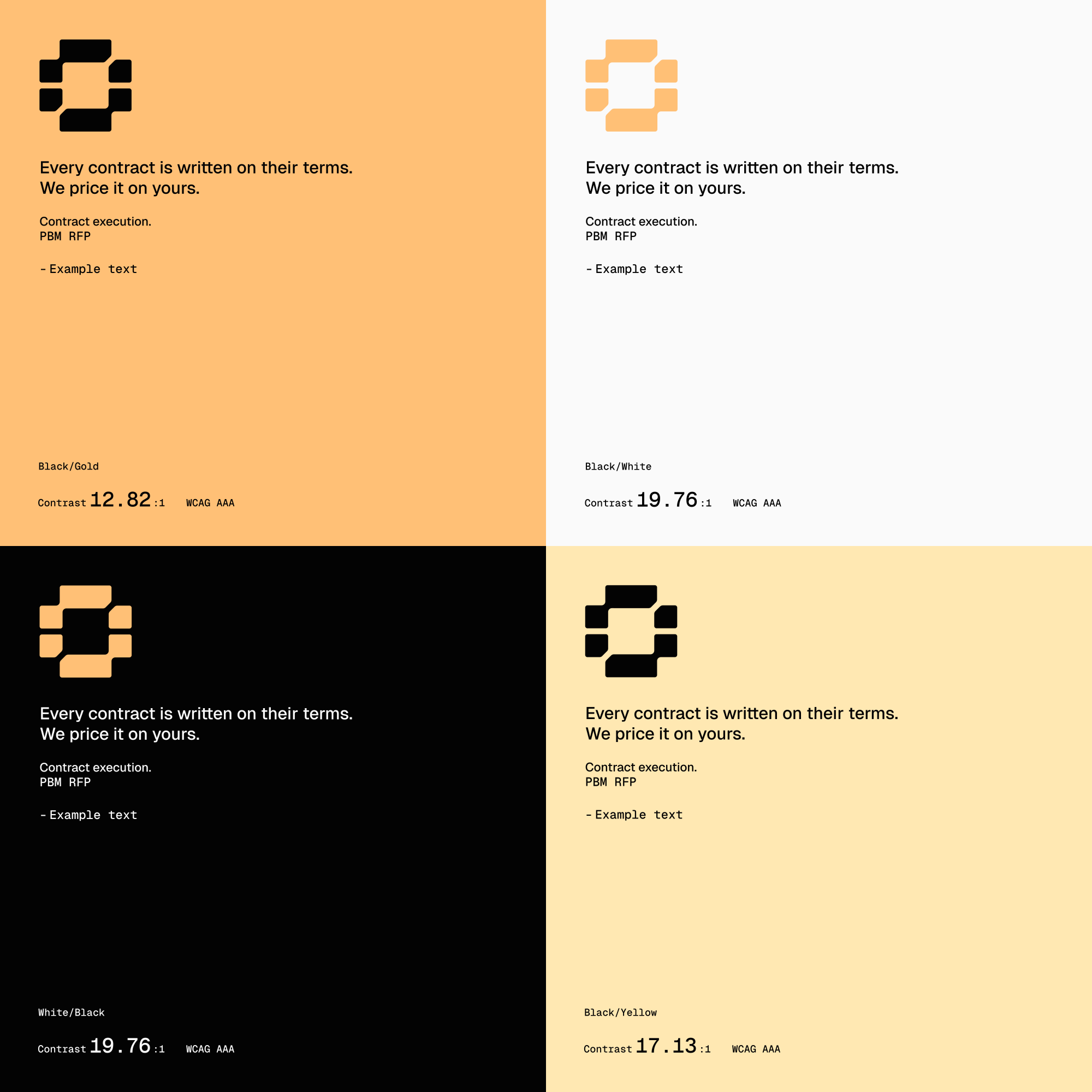
The symbol is built from a sequence of connected geometric forms. Their relationship suggests a network of operations, individual parts working together as a larger system, while the squared construction gives the mark a deliberately artificial and computational character.


Brand Direction
A symbol for the absence of error.
The negative space within the mark references the mathematical empty-set symbol, ∅. When the identity was created in 2023, it was used as a metaphor for the absence of errors in code, connecting the mark directly to Benchify’s original mission of making software more reliable.
As Benchify evolved, the idea gained a new relevance. Today, the company turns healthcare contracts into executable logic to verify outcomes and surface discrepancies, giving the original “no errors” concept an unexpected connection to the product it has become.

Logo System
Built around a symbol strong enough to work on its own.
The identity was designed around a compact, recognizable mark that could move easily between product interfaces, presentations, communications and larger brand applications. Alongside the wordmark, it creates a simple system that remains identifiable even at small scales.
The "Rethink Sans" font was selected for its clean geometry and high legibility, giving the identity a contemporary voice without competing with the more distinctive character of the mark.



COLOR
Warmth against a deliberately technical visual language.
A warm yellow-orange became the identity's primary accent, creating contrast against the more systematic geometry of the mark and helping Benchify stand apart from the colder visual conventions common in technical software.

Font Hierarchy
A typographic system built for clarity and technical precision.
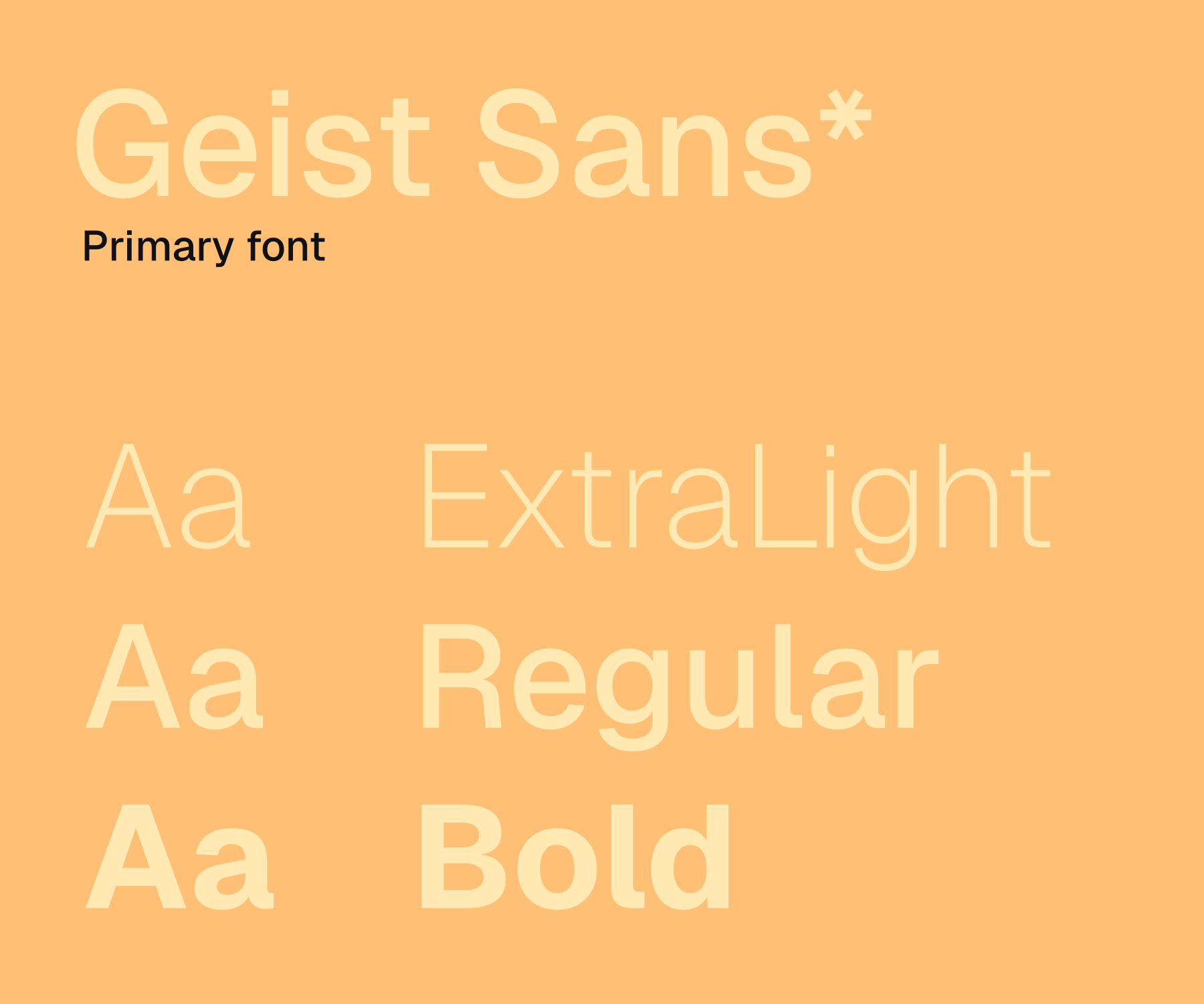
Geist Sans forms the foundation of Benchify’s visual language, carrying both headlines and body copy with a clean, contemporary tone. Its restrained geometry keeps complex information approachable and easy to navigate across digital touchpoints.
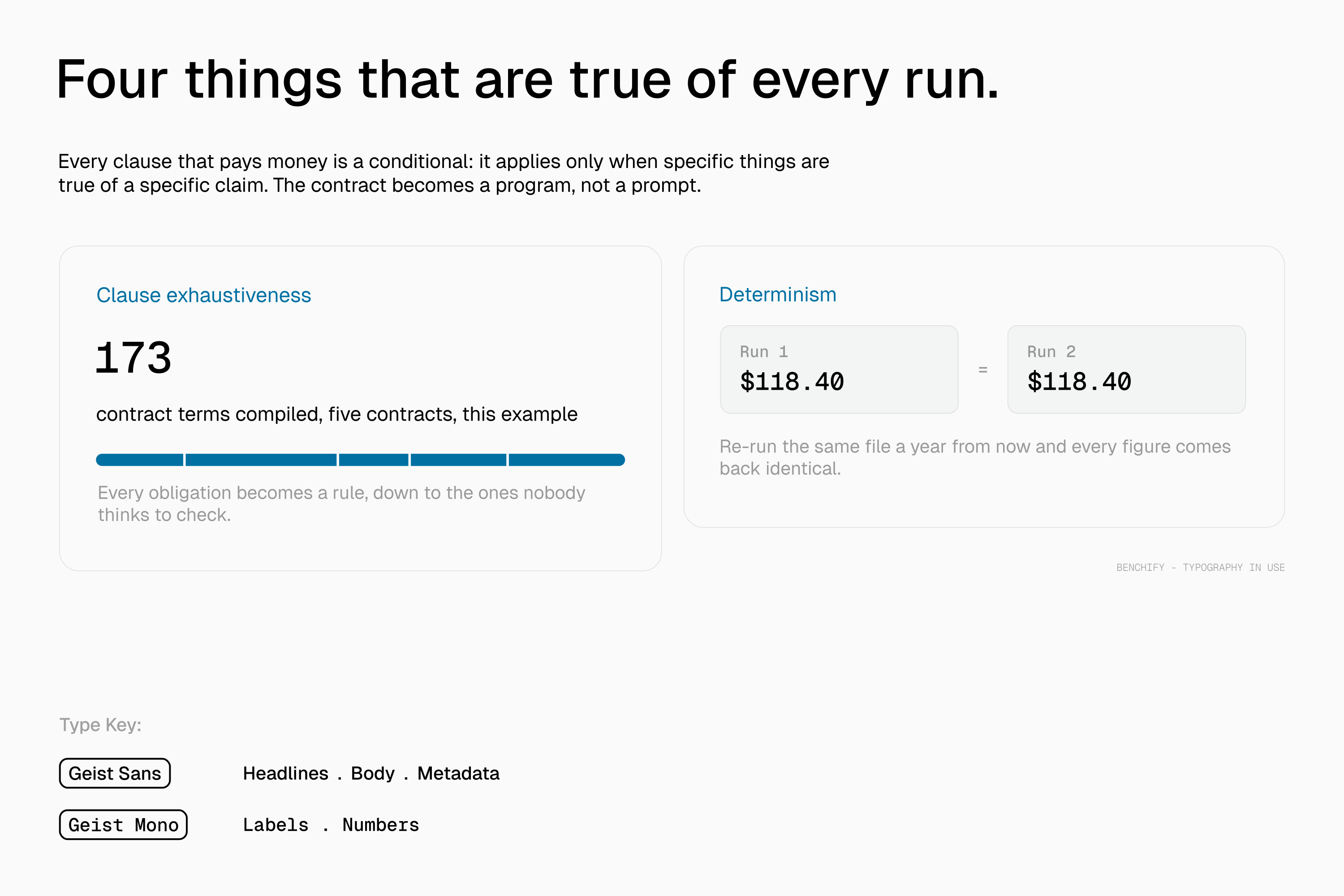
Geist Mono complements it as a secondary voice for numbers, statistics, labels, metadata, and other small informational details, introducing a subtle computational character while creating a clear hierarchy between primary content and technical information.

In Application
Built to make a technical product feel clear, not cold.
Geist Sans forms the foundation of Benchify’s visual language, carrying both headlines and body copy with a clean, contemporary tone. Its restrained geometry keeps complex information approachable and easy to navigate across digital touchpoints.
Geist Mono complements it as a secondary voice for numbers, statistics, labels, metadata, and other small informational details, introducing a subtle computational character while creating a clear hierarchy between primary content and technical information.


Website
The product changed. The identity stayed.
Since the identity was created in 2023, Benchify has evolved substantially. The company later joined Y Combinator's Summer 2024 batch, moved through a significant shift in product direction, from software reliability and error detection to healthcare contract technology. Despite that change, the core identity has remained in use. The abstract logic behind the mark, connection, structure, and the idea of eliminating error, gave it enough room to stay relevant beyond the product it was originally designed for.
Today, the same mark continues to represent Benchify in a very different context.


TESTIMONIAL

Juan Castaño
Co-Founder & CEO at Benchify
Next
Project.
Continue through the selected work.